Plot for ceteris_paribus object
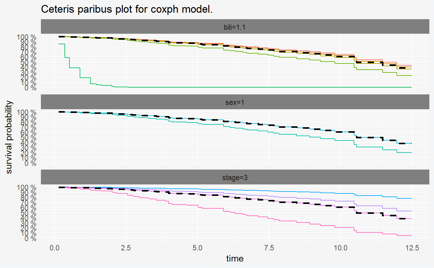
Function plot for ceteris_paribus object visualise estimated survival curve of mean probabilities in chosen time points. Black lines on each plot correspond to survival curve for our new observation specified in the ceteris_paribus function.
# S3 method for surv_ceteris_paribus_explainer
plot(x, ...,
  selected_variable = NULL, scale_type = "factor", scale_col = NULL,
  ncol = 1)
Arguments
| x | object of class "surv_ceteris_paribus_explainer" |
|---|---|
| ... | other arguments |
| selected_variable | name of variable we want to draw ceteris paribus plot |
| scale_type | type of scale of colors, either "discrete" or "gradient" |
| scale_col | vector containing values of low and high ends of the gradient, when "gradient" type of scale was chosen |
| ncol | number of columns for faceting |
Examples
library(survxai)
library(rms)
data("pbcTest")
data("pbcTrain")
predict_times <- function(model, data, times){
                  prob <- rms::survest(model, data, times = times)$surv
                  return(prob)
                  }
cph_model <- cph(Surv(years, status)~., data=pbcTrain, surv=TRUE, x = TRUE, y=TRUE)
surve_cph <- explain(model = cph_model, data = pbcTest[,-c(1,5)],
             y = Surv(pbcTest$years, pbcTest$status), predict_function = predict_times)
cp_cph <- ceteris_paribus(surve_cph, pbcTest[1,-c(1,5)])
plot(cp_cph)